

Project Summary
Redefined Body needed a clean and trustworthy website to sell handcrafted skincare products rooted in holistic wellness. I built a product focused site that highlights ingredient quality, brand values, and shopping simplicity, all while maintaining a calming, modern aesthetic. The design brought product information, brand details, and shopping actions into a consistent layout.
Goals
Present the brand as credible, natural, and professional
Showcase each product with clarity and purpose
Make shopping smooth, mobile friendly, and fast
Align the design with the wellness feel of the brand
Execution
Designed a soft, neutral toned layout to reflect purity and care
Structured the homepage to flow directly into featured products
Created clear product pages with benefits, ingredients, and purchase CTA
Integrated testimonials and about sections to humanize the brand
Prioritized simple navigation, mobile experience, and quick access to cart
Design details
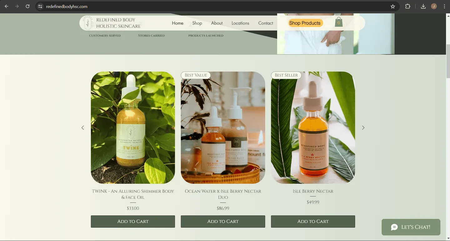
Product images, names, prices, and shopping actions grouped together
Visible ingredient and brand information
Consistent navigation and access to the cart
Turn a calm skincare identity into a clear shopping experience
Redefined Body’s project brief centered on handcrafted skincare, ingredient quality, and a shopping experience that reflected the brand’s approach to wellness. The challenge was to give products enough visual presence while keeping the practical details easy to find.
The product section shown here uses pale backgrounds, muted greens, and botanical photography to establish that atmosphere. Each item then follows a clear sequence: image, product name, price, and Add to Cart. The mood of the page and the shopping task occupy the same layout without requiring visitors to decode a complicated interface.
We set up the homepage to lead straight into featured products, so visitors see them right away. We made sure each product page lists its benefits and ingredients, because shoppers may want to know what a product contains before they buy it.
What did Redefined Body think of the new website?
Alexa Mahaber of Redefined Body loved it. Here’s her review:
I love it. I really do. I love that you put where you can find my skincare at (GTM), and I love the picture of the dripping aloe lol that's a nice touch. Love the before and afters and the new tags, like 'our collection,' and the homepage. I love the way it scrolls better. Thank you so much, Jeff. I couldn't have done it without Trojan Digital Marketing.
A closer look at the product section
| Visible element | Contribution to the shopping experience |
|---|---|
| Three similarly sized product photographs | Creates a consistent comparison area while allowing different product compositions. |
| Names and prices beneath each photograph | Keeps identification and cost close to the item being considered. |
| Aligned green Add to Cart buttons | Gives every displayed product the same recognizable purchase action. |
| Shop Products button and cart in the navigation | Keeps shopping and the current cart visible alongside general brand information. |
Let the photography vary within a stable structure
The individual photographs are different: a bottle among leaves, a grouped product arrangement, and a dropper bottle against broad foliage. They still sit inside similarly proportioned frames. That gives each item its own visual character while maintaining a coherent product row.
The rounded image corners, light surrounding space, and restrained text styling repeat across the section. Consistency comes from those structural choices rather than using the same photograph for every product. This is especially relevant for a small catalog, where each item needs to be recognizable.
Keep buying information close to the product
We put each product’s name and price directly between the photo and the Add to Cart button. We think a shopper shouldn’t have to search the page for a price before deciding to buy. The central product grouping also makes room for a longer name while retaining the same action area as the neighboring products.
Small Best Value and Best Seller labels appear near the top of selected photographs. Visually, they act as secondary cues rather than taking over the whole card. Such labels need a clear basis whenever a brand uses them; the design’s role is to keep them legible without displacing essential product information.
Bring the brand story into the shopping structure
The brief included ingredient information, brand values, testimonials, and an about section. Those are useful complements to a product grid because shoppers may want to understand what a product contains and who makes it before purchasing. The navigation’s About and Contact destinations provide recognizable routes for that deeper consideration.
Redefined Body skincare is also sold in person at Georgetown Market in Indianapolis, the GTM in Alexa’s review. We put that on the site so shoppers in Indianapolis know where to find the products. We’ve worked with Georgetown Market too.
- Give products distinct images. Use a consistent frame and layout to unify them.
- Keep names, prices, and actions together. Make comparison straightforward.
- Use accent colors selectively. Let purchase actions stand out from the surrounding atmosphere.
- Support the next question. Connect product discovery with ingredients, brand information, and contact options.
The Redefined Body design demonstrates a product focused approach that still feels specific to the brand. Talk with Trojan about a storefront that presents your products clearly.
YOUR NEXT MOVE

