

Westfield Roofer
A Westfield, Indiana roofing website that pairs call and inspection routes with five before-and-after project comparisons.
Maybe your contact form sends requests to an inbox nobody checks, or one staff edit breaks the page layout. Trojan Digital Marketing designs and builds websites around the one thing each visitor came to do. We’re based in Indianapolis, run more than 1,400 live websites and work with businesses nationwide.
Jeff Clerisier, our founder, has done web and brand work since 2016 and scopes each project with you directly. The first strategy call is free, and during business hours we aim to reply within five minutes.
Discuss your websiteSee the work firstJeff Clerisier founded Trojan Digital Marketing in March 2018.
Based in Indianapolis, we serve businesses across central Indiana, including Carmel, Fishers, Zionsville, Westfield, Noblesville, Greenwood, Avon and Plainfield.
We also work with clients across the United States.
Moto Supreme, Indiana
Hospitality website

The brief brought the cabin stay, guest activities and booking route into one website. The photos show guests the place, and the menu helps them plan the stay.
Explore this projectTexas Electrician Exam turns an information heavy subject into practice questions, worked calculations and visual labs. A useful tool gives someone a reason to spend time with the material.
Open the learning site case studySee the related planning calculator project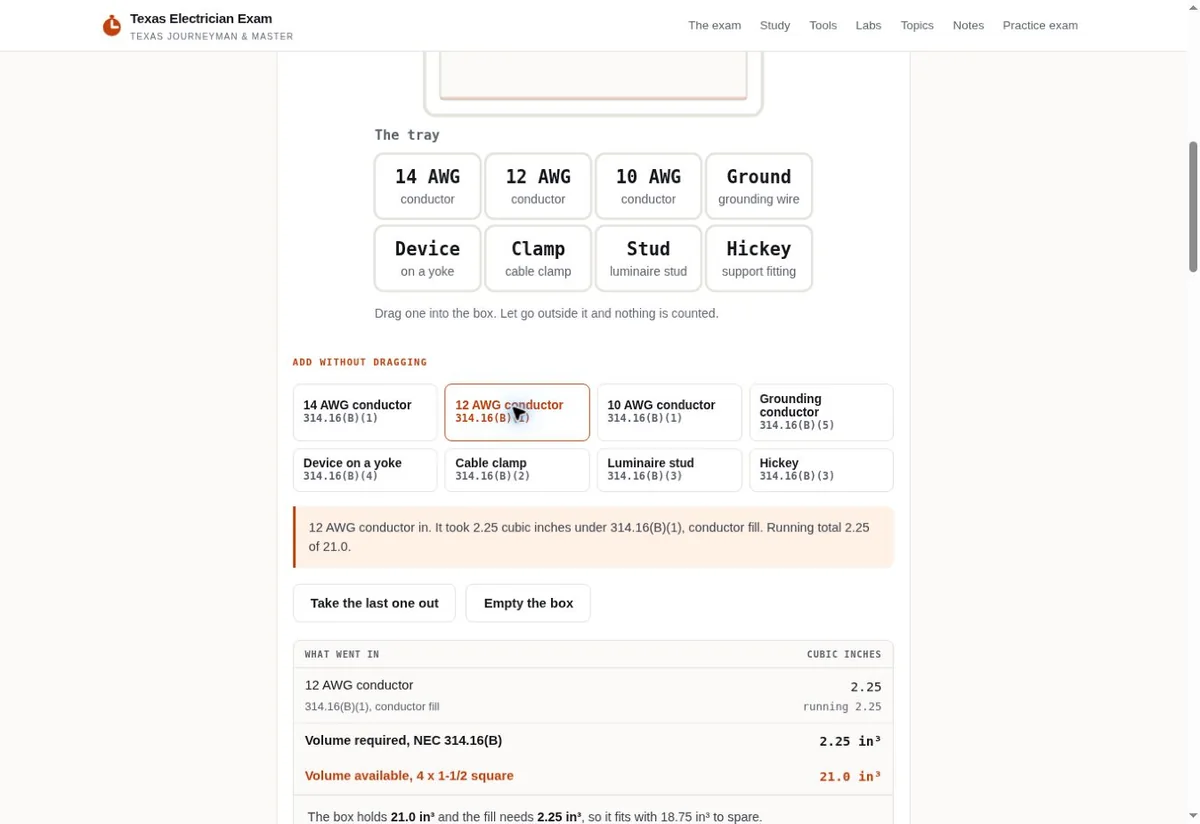
It should settle these four decisions before anyone designs a page. The scope depends on what your business and website actually need.
Agree on the important pages, customer actions and existing URLs.
Use real content and required fields so gaps show up early.
Implement the layouts, integrations and responsive behavior.
Click every link, send a test through every form and note who owns each account at handoff.
We run more than 1,400 live websites, so building and keeping a site online is routine work here.
The plan starts from your average job value, your margin and your close rate, so the budget matches what one customer is actually worth to you.
We work out of Indianapolis and take clients across the country, so the local market knowledge here is first hand.
Walk through the site's contact and booking choices with the people who answer those requests. Check that the destination, required information and next action fit how the business works.
Cost per lead, job profit, invoices, estimates and a website audit are all free to use on this site before you talk to anyone.
Agree on the website's page and interaction requirements before the build. A finished design still needs real customer use to show whether its contact choices help people complete their task.
Design settles what each page says and how it looks. Development is the code underneath it: the page templates, the forms, the connections to tools you already use and how quickly it all loads on a phone. We handle both parts of Indianapolis web development in the same project, so the build follows the pages you approved.
A lot of a developer’s work sits in details visitors only notice when they’re missing. One is a quote form that keeps its answers when someone taps back. Another is a photo gallery that sends smaller images to phones and sharper ones to big screens. We plan those details with the design, so they’re part of the build from the first page.
Some projects need more than a website. If customers have to log in, save a quote, pay an invoice or check their own records, that’s a custom web app with a database behind it. We build those too. Our web app developer page for Indianapolis businesses explains how that work is scoped and quoted. Not sure which one you need? Our guide to choosing a web designer or a full stack developer sorts it by what customers do on screen.
We take on web development in Indiana and nationwide. If you’re comparing web developers in Indianapolis, ask each one who will write the code and who can change it after launch without breaking the layout. We’ll answer both on the free strategy call.
Watch a page come together
Here’s a service page coming together in the order we build one.
A useful website helps visitors understand your business and decide what to do next. Each page should have a clear purpose, whether that's explaining a service, showing relevant work or helping someone request a consultation.
For website design in Indianapolis, start with the questions your customers ask before they contact you. Put the essential details where they're easy to find on a phone. Use readable text, useful photos and forms that ask for the information your team needs to respond.
The project scope should also explain what you'll own and manage after launch. Agree on access to the domain, hosting, website files and analytics. Clarify who handles updates, what ongoing support includes and whether any software or licensed assets carry recurring costs.
If you're replacing an existing site, identify the pages and addresses that need to stay in place before the build begins. That gives the project a clear foundation and helps protect familiar paths customers already use.
Bring your current website and priorities to a free strategy call with Trojan Digital Marketing.
A Westfield, Indiana roofing website that pairs call and inspection routes with five before-and-after project comparisons.

A skincare shop redesign with clear product pages that show benefits and ingredients alongside a purchase button.

More than 30 bilingual signs for the grocery section of Georgetown Natural Foods Market in Indianapolis, in the store’s signature brand colors.
Yes. We inventory the existing pages and identify the URLs to retain before designing. If a URL genuinely needs to move, the scope should include its redirect and updated internal links.
How many pages you need, whether your writing and photos are ready, which tools the site connects to and how many people approve each page. A website build is priced after the free strategy call. Bring your current site and a list of what it must do.
The proposal identifies the technical and on page work included at launch. Ongoing content, local search and campaign management need their own agreed scope. A new design does not guarantee a ranking.
We review the domain, hosting, forms, booking tools and other integrations before recommending changes. Account access, ownership and maintenance responsibilities belong in the handoff.
Yes. The same project covers both. We design the pages, then build the templates and forms that make them work. A build that needs customer logins or its own database is a web app, and that’s quoted separately.
Yes. The project can run by phone and video call, and you approve each page before it goes live.
Usually, yes. We’ll look at the platform and the code to see what can be fixed in place and what needs a rebuild.
“They are amazing. Working with them makes life so easy when it comes to SEO and web design”
A page customers misunderstand, a form people abandon, or a new offer you need to explain. That gives us a concrete place to start.
Based in Indianapolis, we serve central Indiana and clients across the United States.
Talk through your websiteBrowse more projectsService business example: Westfield RooferA rebuild makes sense when the current structure keeps blocking customers or staff. We first separate a design problem from missing content, broken controls, and an unclear offer.
| What you see | What we would inspect | A sensible first move |
|---|---|---|
| The site looks dated | Check whether people can still read the offer, compare services, and reach the right person. Appearance alone leaves the cause uncertain. | Refresh the visual system if the existing page structure still supports the business. Keep the routes that already bring inquiries while the look changes. |
| A key service is hard to explain | Read the questions your team answers before an inquiry becomes a real conversation. Compare those answers with the existing service page. | Plan the missing explanation and where it sits in the menu. A new color palette cannot answer an absent service question. |
| Updates break page layouts | Try a normal staff edit with a longer title, another photo, and an added service. Watch which parts need outside help. | Rework the editing model around those common tasks. Our build choices should fit the person maintaining the site. |
| Requests reach the wrong inbox | Follow a test message through submission, receipt, and staff handling. Check what the customer sees when something fails. | Repair the contact path before buying more traffic. We can then judge whether a wider redesign would add value. |
Keep a short collection of concrete problems. A screenshot of clipped text helps more than saying the site feels old. A sample question can show where the explanation stops too early. We use those observations to choose the pages worth changing. Your business may need a focused service refresh, a new booking path, or a full rebuild. The answer depends on what actually prevents the next task.
For an established business, the existing website contains working pieces as well as weak ones. A familiar resource may be bookmarked by customers. Staff may rely on a particular inquiry field. We ask about these habits before replacing the structure. Bring examples of what you want to keep alongside what bothers you.
A page list should follow the choices customers make. We give each destination a clear job so the menu, links, and content work as one understandable route.

The homepage serves people with different levels of familiarity. A returning customer may need one direct link. A new visitor may need a brief introduction and a service choice. We can serve both with clear labels and short routes. A crowded menu often signals a planning issue. Before shrinking type or adding another dropdown, ask which choices belong together and which deserve a direct destination.
Different page types carry different amounts of detail. A project page can explain a specific design choice. A service page should help someone decide whether to inquire. A resource can teach a task without turning every paragraph into a sales pitch. Our page map keeps those roles clear. It also helps your team see which pages need new writing and which can use material already approved.
Approved writing belongs in the design early. We use real service descriptions and realistic questions so page length, missing details, and awkward claims become visible before polish.
Before
After
Your staff's everyday explanations are valuable starting material. Send the wording you use when a customer misunderstands a service or asks what happens next. We can shape it into page copy while keeping the meaning intact. Business claims still need your approval. A confident sentence about availability, coverage, or included work can create an expectation your team must meet after the site goes live.
Keep a distinction between a fact and an aspiration. You may want to offer a new service next year, but the current page should describe today's offer. You may like a phrase in another company's website, but its credentials and guarantees belong to that company. When information is missing, we leave a clear question for the owner rather than filling the gap with a plausible claim.
Real project material helps a visitor judge the work. We choose images for the question they answer, then add enough context for someone unfamiliar with the project.
The existing project examples on this page show different design needs. Moto Supreme brings a destination and its stay information together. Texas Electrician Exam includes a learning experience visitors can use. Those examples offer more than a style reference. Look at what each visitor came to do, then ask which parts of that thinking apply to your own site. A similar color scheme may have little to do with your customer's task.
A small set of well explained images can be easier to assess than a large, silent gallery. We can place a relevant picture beside the service detail it supports. An image added only to interrupt a long page still has a cost in space and loading. Give it a purpose that justifies that cost.
Responsive work has to survive real content and real actions. We check crowded menus, longer titles, image crops, and form feedback alongside the attractive first screen.
| Moment | What can go wrong | What we want to see |
|---|---|---|
| The menu opens | A long service label wraps into another control, or the close button slips beyond the visible area. | The complete menu stays readable and reachable. We inspect its open state with the real labels your site will use. |
| A customer reads a comparison | A table extends off screen without a clear way to inspect the remaining details. | The reader can compare the options and understand their labels. We choose a suitable phone treatment for the actual content. |
| A project photo is cropped | The narrow layout cuts away the detail the caption asks the reader to examine. | The important subject remains in view. Our crop can change for the placement while keeping the image proportions natural. |
| The keyboard appears | The submit button becomes hard to reach or a field instruction disappears from the visible area. | A customer can continue through the form and correct mistakes. We test the route with the on screen keyboard in use. |
| A page image arrives | Text shifts after the visitor has started reading or reaching for a nearby action. | The page leaves room for the image before it loads. We check the actual asset dimensions and placement. |
A responsive layout should keep the task familiar as the available space changes. The phone view can change the arrangement without losing those answers. We pay attention to the order that content follows when columns stack. A helpful desktop side note can become a confusing opening paragraph if the phone order is left to chance.
Test with your longest reasonable content. A short placeholder title hides wrapping problems. A small demo gallery hides the behavior of an actual project collection. Our checks should include the amount of material you expect staff to publish. Changes in text size matter too. People should be able to read the page without finding that controls cover the words they came for.
Accessibility belongs in the customer task itself. We check how people find a service, open controls, read supporting material, and complete an inquiry using different ways to interact.
Headings help people skim and orient themselves. Their wording should name the content below them, and their order should explain how the page is organized. We also keep important information available as text when a visual carries it. A small screenshot with dense wording should not become the only explanation of a service.
Motion needs the same care as any other interaction. A moving section should leave the words readable and the next control usable. People who prefer reduced motion should still receive the information. We discuss the purpose of an effect before adding it. A calm change of state may explain what a button did. A repeated movement that competes with the task can make the page harder to use.
A form is finished when a real request reaches its intended destination with enough context. We check the customer's experience and the staff handoff as connected parts.
A shared inbox can work well when ownership is clear. Decide who checks it and how another person covers an absence. Those choices sit with your business, though the website can support them. A message that looks complete on screen may still leave staff without the context to act.
Different inquiry types may deserve different handling. An existing customer asking for support should not get lost among new project requests. A job applicant may need a separate route. We can help arrange these paths without making the public form more complicated than it needs to be. Each path should identify its purpose and send the information to the appropriate place.
The editing system should match the changes you expect after launch. We discuss those tasks alongside account ownership so the finished site remains practical to operate.

| Item | What the business should clarify | What to settle in the engagement |
|---|---|---|
| Domain name | Which account controls the name and who can recover access if a staff member leaves. | Identify the responsible owner before any hosting change. We should know who can approve settings that affect the live website. |
| Site content | Which staff members can edit text, images, and public service details. | Agree on the normal editing tasks and the access each person needs. Our setup should support the approved responsibilities. |
| Licensed material | Which fonts, photos, plugins, or services have their own terms and renewal needs. | Ask which ongoing charges depend on those choices. Clarify whether changing providers would require replacing any licensed material. |
| Custom features | Who understands a calculator, booking connection, or other feature that extends beyond standard pages. | Describe how changes and faults will be handled. We should separate ordinary content edits from development work on the feature. |
| Stored requests | Where submissions are held and which people need access to answer them. | Clarify access and retention with the business. Do not assume every staff editor needs to see customer messages. |
| Future support | Which jobs the business can do itself and which require outside help. | Define the support included after delivery and how additional work is arranged. Our proposal should make that boundary understandable. |
A content management system is helpful when staff have regular edits to make. It still needs a sensible content model. A project entry might have a title, approved photos, and a plain explanation of the work. If those pieces are structured, staff can publish without rebuilding the layout each time. We consider the recurring content before choosing which editing controls to expose.
Ownership is broader than receiving a password. Avoid relying on one person's private inbox for every important account. We can discuss which accounts the project touches and who is responsible for each. A future provider change should be considered early enough that account access does not become a surprise at the end.
An Indianapolis, Indiana website can use local detail to answer a practical customer question. We separate a business's confirmed location and coverage from general facts about the city.
Before
After
Indianapolis businesses can serve people arriving in different ways, but the right detail depends on the specific location. Ask whether customers need entrance guidance, appointment information, or a way to check coverage. A general city fact can provide context, yet it should not be stretched into a claim about your customers or the way they travel.
Our base is Indianapolis, Indiana, and the existing work includes national projects. That gives this service page a real geographic home without inventing an office in every market. Your own website needs the same clarity. Explain where the business is based and where it can perform the work. We can support a national offer while keeping public location information accurate.
Website proposals become easier to compare when the included work is explicit. We look at page complexity, supplied material, customer actions, and the responsibilities that continue after launch.
A focused first conversation is easier when you bring the current website and one part that needs attention. Show us the page, explain what customers try to do, and describe what goes wrong. If the business is new, bring the service description and material you already have.
You do not need to arrive with a chosen platform or a complete visual concept. Bring the constraints that matter to the business instead. That might be staff editing, an existing booking tool, a required language, or a launch dependency. We can work through the choices in relation to those needs. The result should be a website your customer can use and your team can keep current.
Sources