

A coordinated signage system for a busy natural foods store
Georgetown Natural Foods Market needed grocery signage that helped shoppers identify sections quickly while keeping the store’s three signature brand colors. The project brief called for more than 30 bilingual signs. That made consistency across the set as important as the appearance of any single panel.
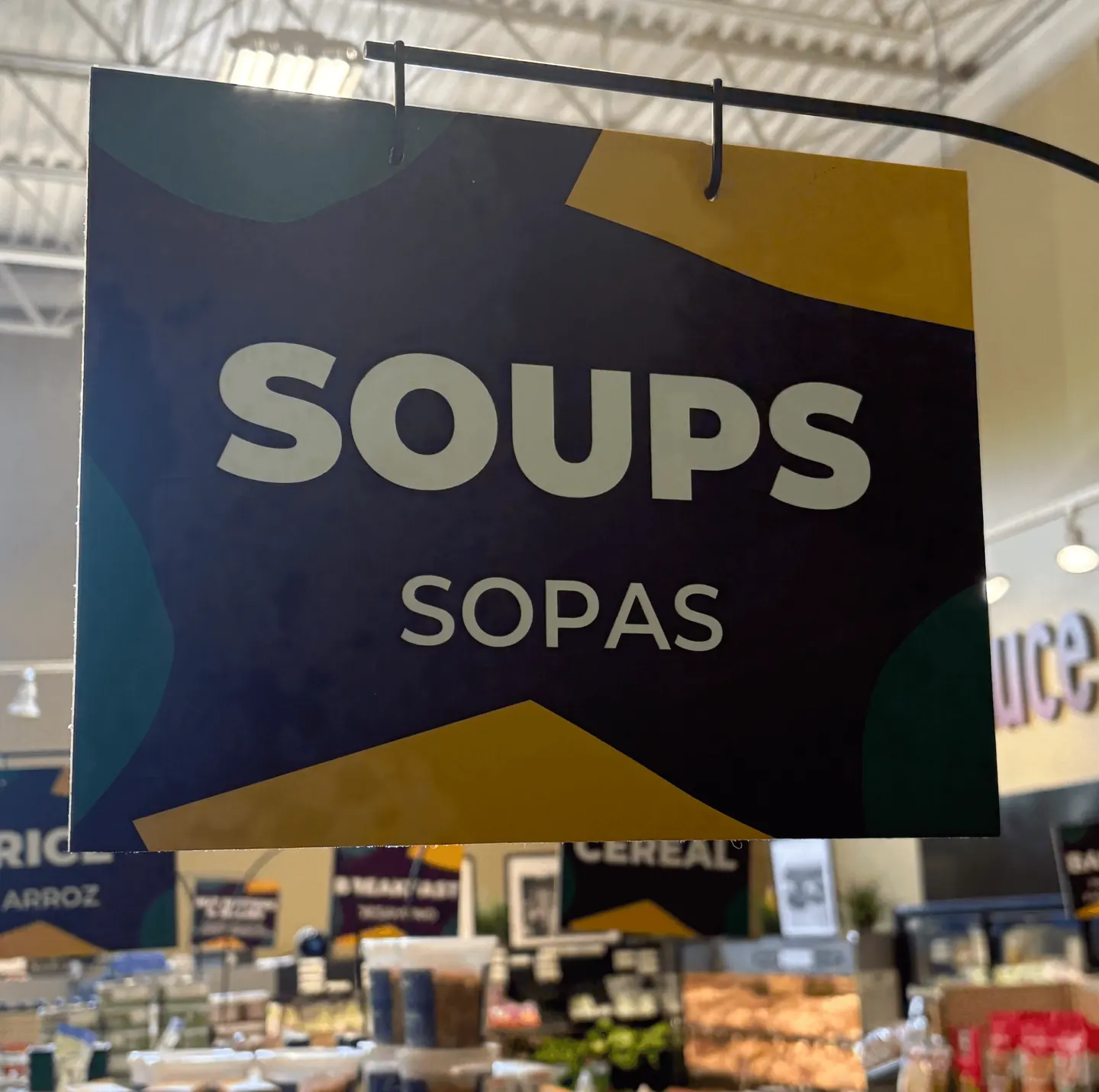
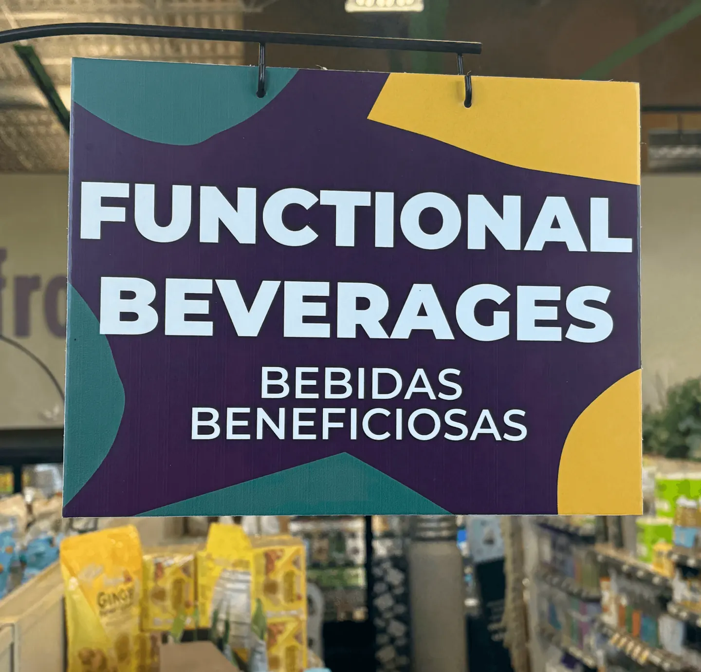
The installed photographs show the design in its working environment: suspended above merchandise, with other signs, fixtures, lighting, and products competing for attention. The signs need to communicate at a glance from within an aisle. A simple category name, visible translation, and consistent layout give the shopper a clear starting point.
How the signs organize information
| Observed detail | Purpose in the design |
|---|---|
| SOUPS above SOPAS | Places the category and its Spanish translation together in a predictable reading order. |
| FUNCTIONAL BEVERAGES across two large lines | Adapts a longer category name while keeping it prominent. |
| White lettering on a deep purple field | Keeps the category distinct from the colorful products beneath it. |
| Teal and yellow shapes around the edges | Repeats the store’s visual identity while leaving the main wording in a clear central area. |
Consistency that still accommodates different words
The soup sign and the beverage sign use the same underlying structure, but their wording needs different amounts of room. SOUPS fits on one line. FUNCTIONAL BEVERAGES occupies two. The Spanish wording also changes in length. This is where a reusable design needs enough flexibility to handle the actual category list.
The category remains the largest element, with the translation immediately below. Decorative shapes stay toward the perimeter. Across a large set, those repeated decisions help the panels read as one store wide system instead of unrelated promotional graphics.
Design for the aisle, not just the artwork file
- Offer
- Explain what the customer can get.
- Evidence
- Support the offer.
- Action
- Make the next step easy to use.
The photographs show why the surrounding environment matters. Shoppers look upward at the signs, sometimes from an angle, with shelves and other category markers in view. Large lettering and generous separation between the two languages help protect the message from that visual competition.
The hanging hardware also sits near the top edge of the panel. Keeping important words away from that area leaves the category unobstructed. These practical details belong in the design conversation early, alongside the artwork’s colors and typography.
What other grocery and health food retailers can use
- Start with the full category list. Test the longest names and translations before finalizing the template.
- Give each language sufficient space. Keep translations connected to the category they explain.
- Review signs in context. Consider viewing angle, mounting hardware, nearby lighting, and product displays.
- Carry the same category names online. Consistent wording between the store and its website can make planning a visit easier.
The Georgetown project shows brand design doing a practical job: helping people understand a physical store. The same attention to naming and hierarchy also matters in retail websites, product collections, and store information pages. Ask Trojan about a coordinated design project for your retail business.
YOUR NEXT MOVE
Make the next step count.
Bring your website, your priorities, and the questions you still need answered. We’ll work through the right next move for your business.
Discuss your project