Need help?Jamie

Market service plans

Castleton Store Websites Where Shoppers Check Stock and Book

Your website shows what you sell but not whether it's in the store today or how to book a fitting, so people call to ask or skip the trip.

Trojan Digital Marketing builds websites for Castleton stores and studios in Indianapolis that answer those questions on a phone. Product pages get a check-before-you-come form or call button, and each booking request goes to the desk or branch that handles it. Simon lists 130 stores at Castleton Square, so your site also has to show why yours is worth the walk.

Send the form with your site's link and the product or booking page customers ask about most. The first strategy call is free, and during business hours we aim to reply within five minutes.

  • Shoppers can check what you carry before the drive
  • Booking requests routed to the right desk or branch
  • Built by a team with more than 1,400 live websites

Jeff Clerisier has done web work since 2016, two years before he founded the company in March 2018. On a Castleton store site, that shows in the parts shoppers notice. A stock question reaches someone who can answer it, and product pages load fast on a phone in the parking lot.

Illustrative business scene: craftsperson fitting oak planks into a new wood floor
IllustrationThis page drawn as a wireframeThe headline, highlights and button from this page, redrawn in desktop and phone layouts. It’s an illustration of page structure and isn’t a client site.PAGE WIREFRAMEtrojandigitalmarketing.com/indianapolis…Castleton StoreWebsites WhereShoppers Check Stock…Shoppers can check what you carry before…Booking requests routed to the right…Built by a team with more than 1,400…Book a free store website call010203CastletonStoreWebsitesWhere…Shoppers can…Booking…Built by a…Book a free…

YOUR WORKING BRIEF

Choose where to start

Select the parts you want to discuss. Your choices carry into the inquiry form.

Discuss this service0 priorities selected

See how I'd approach this

Choose a question
to look at with me.

A website built around the next customer decisionMESSAGE · EVIDENCE · ACTION
  1. A clear offer
  2. Evidence for the customer
  3. An action that works on mobile
A website built around the next customer decision

On a Castleton store site, we give every product page one next step that fits it, such as asking about stock or booking a consultation. The photos and details come from your own store, so shoppers recognize it when they walk in.

Simon: Castleton Square: Simon presents Castleton Square as an Indianapolis shopping destination with store, dining, product, and visitor information. We design browsing pages and visit-planning pages separately, since a shopper comparing products and a shopper checking your hours want different things. What you carry and how you book appointments decide the final page list.

Questions about website design in Castleton, Indianapolis, Indiana

How much does a website cost for a Castleton store or studio?

A custom build is priced after the free strategy call, once we know whether you need online checkout or product pages with a way to ask about stock. The Marketing Startup Kit has a published price: $7,997, or three monthly payments of $2,799. It bundles a 15-page custom site with Google Business Profile optimization, twenty SEO blog posts and three months of consulting.

Can the site show what's in stock without a live inventory feed?

Yes, as long as each page is plain about what it can confirm. Product pages describe the range you usually carry, and a short check-before-you-come form or call button handles a specific model. If your point-of-sale system can publish stock, connecting it is worth a look, but a page should never promise a shelf nobody has checked.

What should a Castleton store's site say about getting there?

Your own hours and the entrance closest to your door, even when your hours match the center's. Simon's Castleton Square page covers the center as a whole, so branch details belong on your site. Not every shopper drives, either: IndyGo's Route 19 is named Castleton and has listed a Castleton Square Mall stop, so it's worth naming that stop on your visit page along with where to park.

How long does a new store website take?

In the published Startup Kit schedule, the custom site is designed and built in weeks two to four, and it goes live in weeks nine to twelve, after the blog posts and Google profile work are done. A store that needs online checkout or a booking tool connected can run longer than that, depending on the systems you already use.

Is there local help paying for a new website in Indianapolis?

The Indy Chamber's Business Ownership Initiative is one place to ask. It's a community development financial institution that makes microloans from 1,000 to 50,000 dollars and offers free business coaching. We have no tie to the program and can't say whether you'd qualify, but its coaches can help you weigh a new site against inventory and your other spending.

Will we be paying Trojan Digital Marketing every month for the site?

There's no monthly subscription attached to a Startup Kit site. The kit is paid up front or in three monthly payments of $2,799, and its three months of consulting start at launch. For a custom build outside the kit, ask about terms on the free strategy call so you know exactly what you're agreeing to before any work starts.

What if the new site doesn't bring more visits or bookings?

You'd see it in the form and call data, which shows the page each request came from, and the weakest page gets reworked first. The Startup Kit's three months of consulting are there for that kind of adjustment. Foot traffic is harder to measure, so a question on the booking form asking how people found you fills part of that gap.

“I had a great experience working with Jeff…”
Heather DoanGoogle review
“…drove a noticeable uptick in leads within just a few weeks…”
Mike BamosiGoogle review

We have more than 1,400 live websites.

We’re based in Indianapolis, where the city and Marion County share one government, Unigov.

We also work with clients across the United States.

Read our Google reviews

What should a Castleton store website plan for?

Website design for a Castleton store in Indianapolis, Indiana has to help shoppers pick you out of a big center and reach you, and one chamber program can help with the cost.

  • Simon's page for Castleton Square describes 130 stores in the center, among them Macy's, H&M, Build-A-Bear Workshop, The Lego Store and Primark.

    With that many stores under one roof, your product pages have to say plainly what you carry, so a shopper picks your store before walking the whole center.

    Simon, 'Welcome to Castleton Square'Checked September 26, 2026
  • IndyGo's Route 19 is named Castleton, and its schedule effective October 2023 lists a Castleton Square Mall stop.

    Some shoppers arrive by bus, so a visit page can give the nearest stop next to the parking and entrance details.

    IndyGo, Route 19 Castleton schedule (PDF)Checked September 26, 2026
  • The Indy Chamber's Business Ownership Initiative is a community development financial institution inside the chamber's entrepreneurship services. It makes microloans from 1,000 to 50,000 dollars, offers free business coaching and put more than 23 million dollars into Indianapolis-area small businesses during the pandemic.

    If a new site competes with inventory for the same budget, the program's free coaching is a local place to talk it through before you commit.

    Indy Chamber, Programs pageChecked September 25, 2026

Simon publishes the store count and IndyGo the bus schedule, while the loan program belongs to the Indy Chamber. We have no part in any of them, and none points to a Castleton client.

How long does a Castleton store website take to build?

This is the published Startup Kit schedule, shown for a Castleton shop; connecting checkout or booking tools to your site can stretch it.

Typical plan

  1. Discovery and strategyWeek 1
    • Competitors and the searches your shoppers use get mapped
    • The keyword and content plan is settled before design begins
  2. Brand and website buildWeeks 2 to 4
    • The custom 15-page site is designed and built
    • Weekly iterations with two formal revision rounds
  3. Content and Google profileWeeks 5 to 8
    • Twenty blog posts written and published
    • Google Business Profile optimized and schema finished
  4. Launch and consultingWeeks 9 to 12 and on
    • The site goes live with launch support
    • Three months of consulting begin, adjusted to real data

What should a Castleton store gather before design starts?

Your store's site goes faster when the product and booking facts come from you and the build details come from us.

  • Photos of your displays and the entrance shoppers use
  • How stock questions get answered today, and by whom
  • Booking rules for fittings or consultations
  • Branch hours, including any that differ from the center's
  • A page map built around product and booking paths
  • Mobile layouts checked for speed before launch
  • Forms that send each request to the right desk
  • Analytics that show which page a request came from

Choose what the customer should do after browsing

Start with the decisionYour serviceFitTrustNext stepScopeEvidenceContact
Fit
Explain the service scope.
Trust
Show supporting evidence.
Next step
Give a clear contact route.
Start with the decisionOne service can lead to different questions about fit, evidence and the next step.

A page showing products should make the next action clear. Can the visitor buy online, ask about stock, request a demonstration, or arrange a consultation? Those actions involve different commitments. We map them before selecting the layout so a prominent button does not conceal an ambiguous workflow.

The opening design gives the product family or service enough context to evaluate. Supporting details then answer the decisions that change the next step. This approach lets a retailer use strong visual presentation without forcing every visitor through a promotional carousel before reaching useful information.

Build comparisons around meaningful differences

An interactive comparison deserves space when the differences affect a buying decision. We can prototype a selector based on owner approved attributes such as dimensions, use, or service options. The selected result should explain why it was shown and make clear when staff review is needed. It should not manufacture compatibility or an instant quotation.

On mobile, the comparison keeps labels connected to values and provides a readable alternative to a wide table. We test the controls with touch and keyboard input. Product images should show meaningful details rather than merely decorate another set of generic boxes.

Prototype a proposed flooring consultation journey

Suppose a hypothetical Castleton flooring retailer sells materials and arranges installation consultations. Customers currently submit a product name without explaining the room or whether they need installation. We would propose a browsing path with material categories and a consultation route asking for broad project context and an optional photograph.

The response would explain that material suitability, measurements, and installation scope require review. A comparison section could help customers understand the questions considered during that review. The business approves the actual differences and process, and the design avoids presenting a selected finish as a confirmed project specification.

Make branch and service routing part of the interface

A customer may know the brand but not which location handles a particular service. We review how the site chooses a branch and whether that choice remains visible through the form. The receiving team should see the selected service and location without asking the customer to repeat the entire request.

The design includes error states and an accurate confirmation. If the customer is requesting an appointment, the receipt should identify whether staff must approve it. If a product is only available for inquiry, the button should not imply a completed reservation. These are essential parts of the conversion design.

Prepare a visual system with a performance budget

We define the image sizes, interaction behavior, and reusable layouts needed for categories, services, and branch information. Large catalog photography is prepared for its displayed role, with responsive sources and stable dimensions. Decorative effects should not prevent a customer from opening a product or completing the form.

Google’s Core Web Vitals guidance measures loading, responsiveness, and stability. We use comparable checks on the browsing and appointment paths, then record the conditions. A tested improvement is specific evidence; it should not become a promise about every device, connection, or business outcome.

Give the business a maintainable handover

The CMS plan identifies the product data source and the fields staff can edit for consultation details, images, and branch information. We ask who approves technical facts and who changes a service when capacity or operating arrangements change. That keeps the site’s presentation connected to the people fulfilling its offers.

A first project can include journey mapping, a visual prototype, approved page content, form implementation, and task testing. Review later inquiries for missing context, wrong branch routing, and repeated misunderstandings. Those observations reveal where the interface needs refinement without assuming a redesign caused every change in store sales.

Put the first scope in order

  1. Define whether each product action buys, requests stock, or starts a consultation.
  2. Prototype the comparison and branch selection using approved product distinctions.
  3. Test the receiving message and the confirmation for each appointment path.

Compare Castleton planning, the Indianapolis directory and website design.

Let’s review how your Castleton product page moves a shopper toward the right inquiry.

Sources & further reading

Talk with Trojan Digital Marketing

Where should a customer go after taking the product home?

Give existing customers a help route that starts with their item and question. We can design that route without guessing what your showroom handles.

A purchase changes the visitor's task. Someone who already has the product may need a missing instruction, a part name or help understanding a label. Your sales page may explain why to choose the range while leaving that person unsure where to ask. We start the help brief with actual questions supplied by the business. A short list of recent, anonymous examples can show what needs a page and what needs a person.

For a Castleton showroom in Indianapolis, Indiana, the project can focus on these follow-up questions without rebuilding the catalog. We ask which questions the branch answers itself and which belong with a supplier. The interface should preserve that distinction through the message. Our design work defines the wording and receiving path. Your staff approve who can answer, what they need to see and which requests they must pass elsewhere.

  1. Separate the customer task Choose a clear help label based on what someone needs after purchase. A label such as product instructions gives more context than another contact button. We check whether customers must identify an item before seeing the next choice. Keep a general question route available when they can't find a model number. The page should help them begin with incomplete information rather than force a guess.
  2. Identify the receiving responsibility Name the role that handles each help category within the business. A job title can be more stable than a staff member's personal inbox. Ask whether the person can answer directly or must first inspect the item. We can connect a form to the approved route once that responsibility is clear. A polished receipt should never imply that a supplier has already accepted the request.
  3. Define the information boundary Set the facts that the page can answer from approved instructions. Leave diagnosis and product-specific advice to the person authorized to give it. If the showroom refers a question elsewhere, explain how the customer obtains that contact. We need the business to confirm the actual arrangement. A supplier logo or product photograph gives us no basis to invent a support agreement.
  4. Choose a manageable first release Start with the questions that staff can keep current. A small help area can be a better first purchase than a large library of copied manuals. Our proposal can identify the selected tasks and the content needed for each. You can then compare the work with the time available to approve it. Extra categories should earn their place through a real customer question.

Which instruction belongs to this exact item?

Attach help wording to an identifiable product and version. Our content model can show that relationship before a customer opens the wrong instruction.

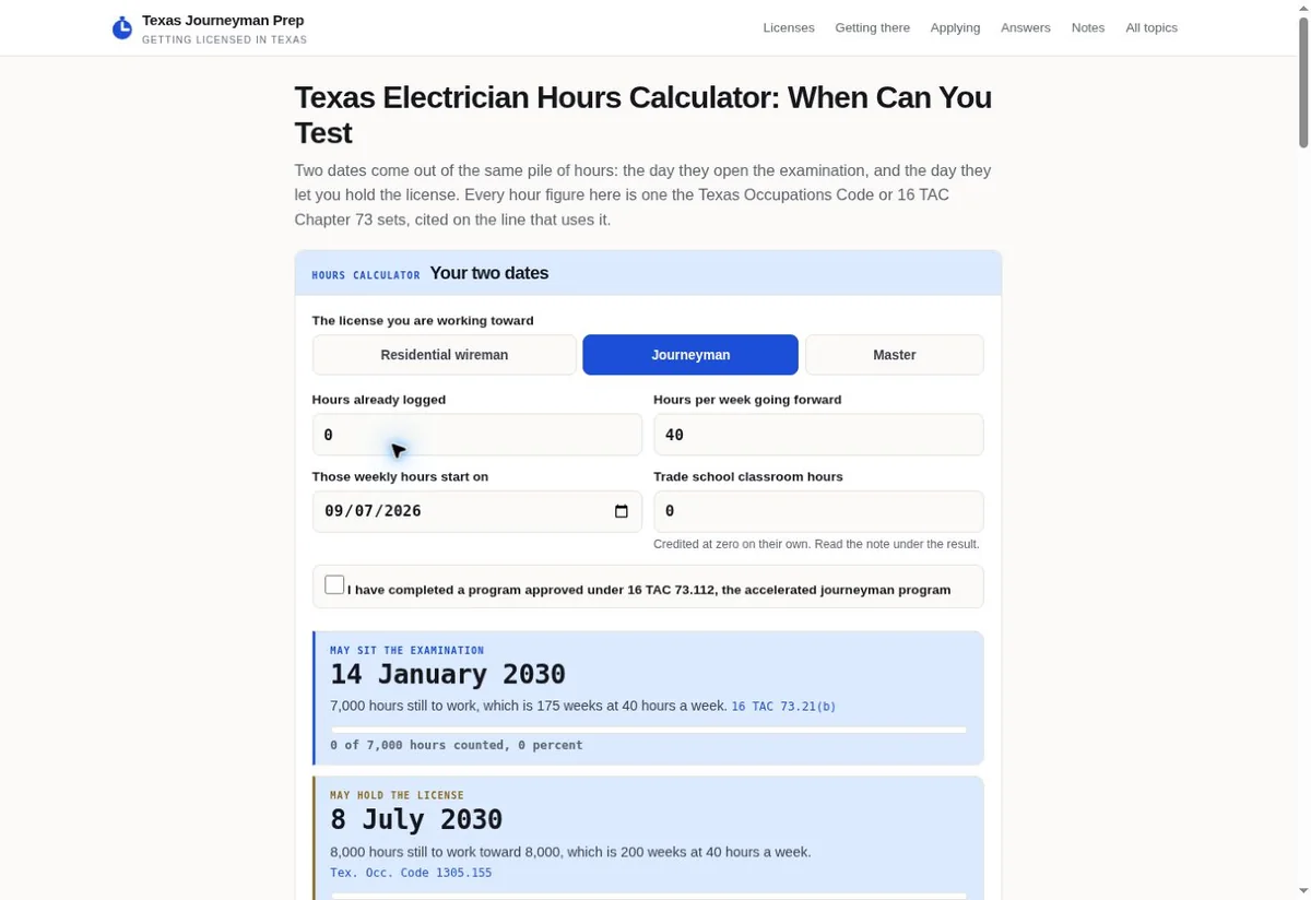
Texas Journeyman Prep homepage with two choices
Label version: Texas homepage shows distinct visitor task choices. View the project
Showroom instruction matching checks
RecordBusiness inputPage acceptance
Model labelSupply the wording and number that distinguish the item from similar products. Tell us where the customer can find them. We should not ask for a code the package never shows.The page explains the location of the model identifier in ordinary language. A customer can say the code is unreadable and continue with a question.
Instruction fileIdentify the approved document, its applicable item and any version marker. Permission to publish comes from the business or the relevant rights holder. A file found online is only a lead.The displayed document title identifies what it covers. Its download link opens the approved file. The surrounding page gives a contact route when the customer is unsure of the match.
Changed packageExplain whether a new label represents a renamed item, a different specification or only new artwork. The website editor needs that distinction before changing instructions.The help page uses the business-approved relationship between old and new identifiers. It avoids combining different products because their boxes look alike.
Missing informationDecide what staff need when a customer lacks the packaging. A purchase reference or optional photograph may help if the business can use it safely.The form marks optional information accurately. Its message asks for the available clue without making an unsupported item identification.

A downloadable sheet can keep circulating after its product page changes. We ask how the business recognizes the approved copy and how an editor finds every link to it. That includes help pages as well as old campaign destinations. The task is to replace the wrong instruction wherever you control its publication. Copies on another organization's site need their own correction route.

The existing Texas homepage pictured here presents two visitor task choices. We can use that reference to discuss how a help page separates questions with different next steps. The image isn't a retail support system or proof of a completed task. Your own help choices need approved item wording and a separate check of their receiving routes. We would inspect those choices with the relevant branch role before acceptance.

What can the page say when someone asks about a return?

Explain how to raise a return question using your approved policy. We should leave the outcome open until the business has the facts it needs.

Can a form decide whether the item qualifies?
Only if the business has an approved process that supports that decision. We won't derive eligibility from a checkbox or a photograph. A first design can collect the reason for the question and route it for staff assessment. The button and receipt should reflect that limited action. Your policy owner must approve any wording about time limits, condition or exceptions before we add it.
How much purchase detail should we ask for?
Ask for the detail your receiving team actually uses to locate the purchase. That may differ between a cash sale and an online order. We can mark the relevant fields once the business explains the process. Keep a route for someone who can't supply the reference. Requesting a complete receipt image by default can expose unrelated information and may add work without helping the first response.
What happens when the customer chose the wrong branch?
The page needs an accurate next step supplied by your business. That might involve contacting the selling branch or having a team member forward the question. We ask which arrangement is real and whether the customer must act again. The interface should keep the selected branch visible. It should not quietly send the message somewhere else while displaying the original branch as the recipient.

A return question often includes emotion as well as a product code. The form can make room for a short explanation without asking the customer to choose a legal or technical conclusion. We can label the field around what happened and what help they want. Your staff then have a clearer starting point. The website shouldn't tell someone that dissatisfaction proves a defect or that an opened box automatically ends their options.

Your existing policy may live in a separate document. If the help route links to it, we need to confirm which edition applies and whether the language on the form agrees with it. We can identify conflicts during the content work. The business settles the policy. Once settled, the same wording needs to reach the confirmation and any staff template that repeats it.

  • Ask the policy owner to approve the public description of what staff check. That includes the difference between receiving a question and agreeing to an exchange. Keep their actual limits visible where the customer chooses this route.
  • Provide an ordinary contact option when the customer can't complete the online form. We can design the placement, but the number and the department's responsibility must come from your branch.
  • Use a labeled practice request to check what the receiving person sees. The test should contain fictional purchase details and state that no return action is being requested.

How does a vague help request become an answerable question?

Keep the customer's description attached to the product clues. We can add a modest sorting step that helps staff understand the request without guessing its cause.

An unclear message isn't always a poor customer effort. The item may have several names, or the package may be gone. A short help form should allow that uncertainty to remain visible. We can offer broad question types and an open explanation. Your team decides which types change the receiving route. Categories added only to decorate the form create choices that someone must interpret later.

The customer's selected topic and written explanation should travel together. If a topic choice says instructions while the text asks about a missing part, staff need to see both. We can design the receiving message so neither clue gets lost. The business then decides how to handle that mismatch. It should remain possible to correct the route without rewriting what the customer originally said.

Hypothetical example An imaginary Castleton lighting showroom receives a question about a product the customer can no longer identify.

Before

  • The fictional customer remembers buying a small reading lamp but no longer has the box. A form demands a full model number before it can proceed. The customer chooses a similar number from a current product page just to send the question.
  • The receiving message contains that guessed code and a general request for help. The staff member can't tell whether the code came from the lamp or the website. A proposed answer could therefore begin with the wrong item.
  • The old receipt says the support request has been approved. Nothing in this exercise gives the showroom enough information to make that claim. The customer only knows the form accepted the entered text.

After

  • Our proposed form includes an option for an unknown model and a place to describe the item. An optional image has a stated purpose. The message makes clear which details the customer supplied and which remain unresolved.
  • A staff role approved by the showroom receives the fictional message with the original explanation attached. The test asks that person whether the clues are enough for the next conversation. It does not ask them to diagnose the product.
  • The proposed receipt confirms that the question was sent and names the business's actual next contact route. The exercise ends by checking that the entered description reaches that route intact. No response speed or product outcome is claimed.

Which phone checks reveal confusing help wording?

Try the help task with incomplete product information and an ordinary phone screen. Our acceptance checks should include errors and recovery, alongside the successful path.

Texas Journeyman Prep calculator with labeled fields
Screen message check: Texas calculator presents labeled planning inputs. View the project
  1. Read the instructions before entering data Use the business-approved help page without opening another tab to explain it. Check whether the item field tells the customer where to look. We also read the optional-image instruction on the screen where the file is chosen. A label hidden below the control can leave the customer guessing. The test records that confusion so the wording can be corrected before acceptance.
  2. Send a recoverable mistake Use fictional details and leave a required field empty. Check that the form names the missing information and keeps the rest of the text. We then enter an incomplete email address and try again. The correction should be understandable at the point of failure. We shouldn't need a staff explanation to know which part of the form needs attention.
  3. Inspect the receiving copy Have the designated tester inspect the practice message. Verify that its subject doesn't imply a purchase, reservation or approved return. The selected help category and item clues should appear together. We can compare the message against what was entered on the phone. Any missing field needs a fix or an explicit reason for leaving it out of that receiving view.
  4. Follow the recovery route Check the alternative contact when a message cannot be sent. Its label should explain what the customer can do there. We also return to the help page from the error state and confirm the relevant item context survives where intended. A successful test is a recorded result for this path. It isn't proof that every future device or connection will behave identically.

The companion calculator capture shows how labels can sit beside planning fields. Your help page will have its own content and error states. We can use a realistic but fictional question when testing those states. A visual reference helps discuss placement; it doesn't replace checking the form itself. Keep that distinction when deciding what the agency has actually delivered.

Before commissioning this work, ask which paths the quote includes. A normal submission, a missing product code and a sending failure require different checks. If a connected system belongs to another provider, its behavior may need separate access or cooperation. We can explain that dependency during the project discussion. Your acceptance terms should identify the part we can implement and the part another organization controls.

What should happen when an instruction is replaced?

Keep the applicable information reachable and remove misleading active links. Our handover can give the showroom a repeatable way to retire a document when its source changes.

Retirement starts with the item relationship, because an older instruction may still apply to an older product. Deleting it everywhere could leave an existing customer stranded. Keeping it beside the new file without explanation can cause a different mistake. We ask the supplier or authorized merchandise person to define the difference. The page can then identify which customer should use each version.

The website editor needs a clear list of places under your control that refer to the document. That includes the help page, a category note and any published download button. We can make those relationships part of the proposed content model. Ask who will receive a supplier change and who can publish the correction. An ownership gap can leave a careful initial build outdated.

Should old product help disappear from navigation?
That depends on whether it still answers a valid after-purchase question. We can reduce its prominence while keeping an accurate destination for the relevant item. If the advice is withdrawn, the page should say how to obtain current help. The business approves that language. Keeping an obsolete PDF merely to avoid changing a link isn't a sound content decision.
Can we redirect every old file to the newest manual?
A newer manual may cover a different product. We first need the authorized source to confirm that the replacement applies. If it doesn't, choose a destination that explains the unresolved match and provides a contact. Our implementation can follow that agreed choice. A redirect that silently changes the applicable model makes the page easier to maintain at the customer's expense.
What should the quote say about future changes?
Ask whether the engagement includes only the first release or ongoing help-content updates. Identify which edits staff can make and which need another technical task. We can discuss those responsibilities before you commit. Avoid assuming that buying a help area also buys unlimited supplier monitoring. The agreement should make the expected inputs and maintenance responsibility understandable.
  • Choose one replaced instruction for a handover exercise. We can follow its existing links, apply the business-approved replacement rule and check what an older-product customer sees afterward.
  • Keep a record of the approving role and the applicable item version with the content. That gives a later editor a starting point when a supplier sends another change.
  • Bring the unresolved cases to the project discussion, especially products with unclear identifiers. They help us judge whether the first purchase needs a simple help form or a more detailed document structure.

What are you buying in the first help-page project?

Price the selected help tasks and their connections together. We can discuss a focused first engagement once the branch identifies the questions it wants the website to handle.

Which connected system belongs in the quote?
Identify the system that receives a help message and the person who can authorize its connection. We need to know whether it has a supported route for the proposed fields. A quote for the page alone may leave that receiving work unresolved. Ask us to explain what can be connected with current access and what needs cooperation from the system's owner.
How can we judge the proposed work before accepting it?
Choose a few fictional customer questions that reflect your real help categories. The agency should explain how the proposed page handles each one, including an unknown item. We can walk through that proposed behavior with the approving staff role. Keep the acceptance tied to accurate routing and usable content. Sales changes and product resolutions depend on factors outside this small website task.

Sources

From the businesses we've worked with

“They are amazing. Working with them makes life so easy when it comes to SEO and web design”
George B.Google review

Marketing help for Indianapolis businesses

Based in Indianapolis, we serve central Indiana and clients across the United States.

Request a free strategy call

Indianapolis, Indiana

Service area map

Explore Indianapolis on OpenStreetMapArea reference; this is not an office pin. Map © OpenStreetMap contributors.